
Welcome
A brand identity is a vital element in communicating a company’s market differentiation and brand values. It is definitely the most visible element, and as such, should be treated with care and consistency.
This identity manual sets out fundamental rules and guides to help create and maintain a strong, recognizable and meaningful brand. Used properly, it will allow the brand to continually reinforce the company’s vision, mission and core values while attracting the target audience.
You want your brand to live in the hearts and minds of prospects and customers. Use this manual judiciously, and you’ll be well on your way to making that happen.
Brand Platform
The Chicago Industrial Fasteners Platform defines the essence of the organization and is meant to guide all activities and communications.
Vision
Every request satisfied.
Mission
CIF is committed to providing a unparalleled service that helps it’s customers achieve peace of mind. Our team works together to engage industry leading practices, partners and resources to continually exceed client expectations and deliver the most reliable experience possible.
Core Values
Client Focus. We look to establish rapport and trust with our clients and then by understanding their unique needs we leave no stone unturned in or effort to devise ways of meeting and exceeding their goals.
Integrity. We hold ourselves and our trade partners to the highest ethical standards that are guided by a focus on delivering exceptional value to our clients.
Teamwork. We work collaboratively to engage the collective strengths of our team and trade partners. Our proprietary work processes and communication systems enable us to continually maximize efficiencies and
ensure that relocations are completed on time and on budget.
Empowered. We believe that organizational excellence is achieved when individuals are empowered to utilize all of their skills, ability and creative spirit. To achieve this goal we foster an environment that provides for individuality, advancement and a team focus on our singular vision.
Accountable. All team members hold themselves personally responsible and accountable for all services provided by CIF. We listen and strive to understand the complexities of our clients needs and work to ensure success while communicating with all stakeholders in a clear and timely manner.
Brand Identity
Logo
The logo is the visual representation of an organization and is the most important carrier of the identity. Therefore, it is critical to use the logo consistently and with consideration for the image it projects. The logo should be used to unify and strengthen all internal and external communications.
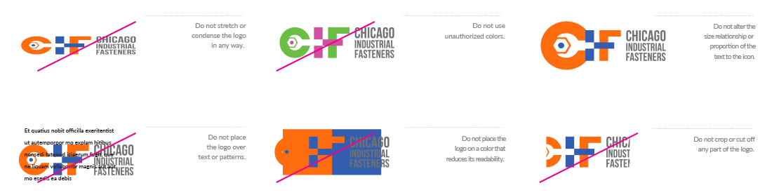
The logo is distinct and its forms have been carefully considered. This is why they may not be altered in any way. Using the logo incorrectly undermines the brand and causes inconsistencies with your image. It is therefore very important that this manual be followed carefully.
Unacceptable Usage
The logo should never be used in the following ways:
Tagline
The tagline represents the cornerstone of the brand and is second only to the logo in importance. Therefore, it is imperative to use the tagline consistently.
The tagline, and its placement in all of its forms, have been carefully considered. It should not be altered in any way. Additionally, you should always consider using the tagline with the logo in all communications whenever possible.
On certain occasions the tagline can be used separately from the logo as a design element, such as when it’s used on the same piece of collateral.
Support Element
The Chicago Industrial Fasteners‘ icon mark can be used separately from the logo on certain occasions as a design element.
Clear Space Requirements
Clear space gives the eye a place to rest and also helps direct the eye to what we want to be seen.
A minimum amount of clear space must be maintained around the logo at all times to ensure its visibility and protect its integrity. The clear space differentiates the logo from all other elements on a page including all text, graphics, photographs and the edge of a page, which must be kept outside the clear space.
A simple rule for determining the appropriate amount of clear space is the height of the C inside. The height of the C inside is based on the height of the inside of the C letter or wrench in the logo. Simply measure the height of the C inside to determine the minimum amount of clear space that should surround the logo.
The height of the C inside is applicable for a logo of any size. Additionally, the clear space may be greater than the height of the C inside, but never less.
Color
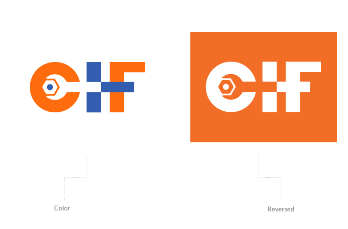
Logo Colors
Logo colors are an incredibly integral part of the brand identity. Using the colors consistently enhances brand recognition and strengthens value.
Utilize the supplied color samples and their standards to specify the colors when using an outside source for reproduction to ensure a color match.
In special applications where a unique result is desired, the logo may be blind embossed, etched or engraved in the color of the carrier material.
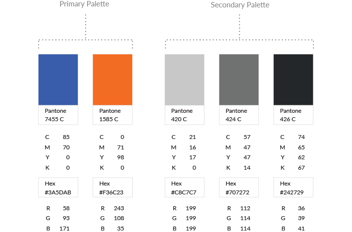
Color Palette
The palette represents the spectrum of acceptable brand identity colors and should be used for all types of media. The primary palette represents the colors that should be used the most and the secondary palette represents the colors that should be used as accents. No other colors should ever be used.
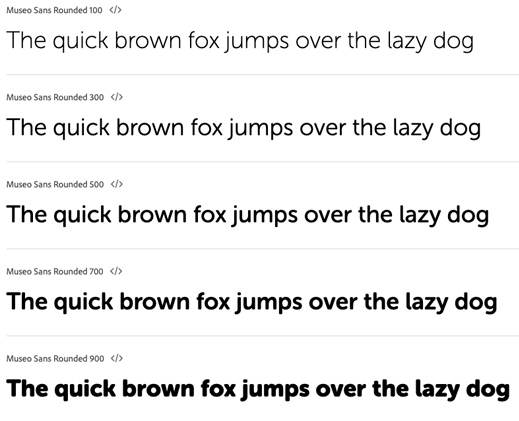
Typography
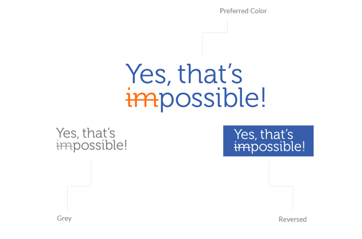
The typeface selected for Chicago Industrial Fasteners helps create a consistent and recognizable brand presence in all communications. Museo Sans Rounded should be used on all internal and external applications including all printed communications, digital presentations, signage, promotions and merchandise.
For website and email applications in which Museo Sans Rounded is not available, it may be substituted with Calibri or Arial.
In most cases, the variations in the Museo Sans Rounded family of typefaces offers a lot of flexibility. However, using more than two or three variations in one document is not recommended. For the best results, follow these simple rules:
- For running text use Museo Sans Rounded 300.
- For bold text use Museo Sans Rounded 700 or 900.
- For captions use Museo Sans Rounded 100.
Brand Assets
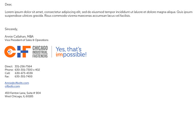
Email Signatures
An email signature template has been created to ensure brand consistency and quality of electronic communications.
All employees should use their signature in all email communications.
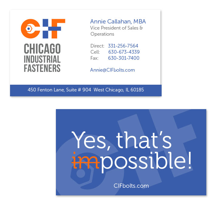
Business Cards
Business cards often provide a first impression as well as a lasting impression. The front and back layouts of the business card must be followed consistently. The size of the business cards is 2 x 3.5”.
Request Business Cards

Files
A variety of file formats for the material covered here are provided. This is a quick list of what each file format means, and where they would best be used.
Brand Identity Graphics
.ai format is the “raw” format and will likely never be used internally.
.eps format is a standard logo format and is ideal for printers and other professional uses.
.jpg format is lower quality but will work well for internal use with Microsoft office software.
.png format is similar to .jpg except it has a transparent background and not all applications recognize it. This format is ideal when placing the logo on top of color.
Brand Asset Graphics
.idml and .indd formats are the “raw” format and will most likely be used by a printer or designer.
.pdf format is used to present documents in a manner independent of application software, hardware and operating systems. It is not editable.